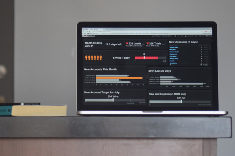
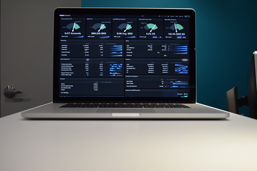
Each week we feature an app that has caught the attention of the Crozdesk community. We look for exciting features that make our lives easier, apps that take a radical approach to existing problems or a service that has everyone talking about it. In other words, apps that we think you should know about. This week’s featured app is data visualisation platform Klipfolio – an innovative solution that combines data from multiple sources into visually attractive and accessible dashboards.
High-Performance Data Visualisation

High-performance data visualisation platform, Klipfolio
Online dashboards are becoming increasingly popular and with good reason – they offer users the opportunity to view data from multiple sources in real-time. Easy-to-read, constantly updated data visualisations can inform decision making and improving business efficiency. Data visualisation platform, Klipfolio has been specifically designed for creating real-time visual displays using multiple data sources.
Klip Gallery: Connecting Klipfolio to external Applications

The Klip Gallery within Klipfolio allows users to connect to data from a range of external applications
Once signed in to Klipfolio, users will need to populate their dashboard with Klips – individual visualisation panes connected to a data source. There are three options when it comes to creating Klips, the first of these involves connecting Klipfolio to a 3rd Party Application. Klipfolio is set up to integrate with well-known data connectors such as Google AdWords; Salesforce; DropBox; Buffer; MailChimp and Campaign Monitor. Having clicked on “Add a Klip” in the main dashboard, users are presented with a list of these connecting applications. Selecting an application will prompt Klipfolio to request access to the account for that application. Once access has been granted, Klipfolio will suggest a number of templates for connecting to data from that application. As an example, LinkedIn templates include Clicks; Clicks and Likes; Comments; Engagement and Followers by Company Size, Location, Industry and Function. Make a selection and Klipfolio will automatically connect to that data.
Klip Builder: Building a Klip from Scratch

The Klip editor within Klipfolio offers a range of tools for creating and editing Klips
As an alternative to connecting to an external application, it is possible to build a Klip from scratch. Clicking on the “Build New Klip” button within the “Add a Klip” window will bring up a Klip construction platform equipped with a sophisticated range of tools for Klip building and editing. The Klip construction platform comes with a range of components or Klip types, depending on the type of data visualisation required. The 15 available components include Value Pairs, for monitoring two related values; Tables for displaying two-dimensional data; Sparklines for monitoring changes to KPI’s over time and Pie Charts. Having selected an option, Klipfolio will request a data source – whether Excel; CSV; XML; JSON; URL or Google Drive link. Alternatively, it is possible to use data which is already in the Klipfolio library or skip specifying data at this stage and add data once the Klip design process is complete. If a data source is specified at this stage, the data will appear to the bottom left of the Klip Editor window. The main components of the Klip can be changed using the right-hand toolbar, while specific axis settings can be altered to the left of the screen. More than 60 programmed functions are available for editing, selecting and manipulating data.
Telling the Story: Altering the Layout of a Klipfolio Dashboard

Layout options and indicators can be used to bring out the story within a data set
Presenting data involves a certain amount of storytelling – picking trends and themes buried in the data and bringing them to life. Klipfolio offers a number of tools designed to do this. The layout of a Klipfolio dashboard can be edited by selecting one of the 17 pre-set layouts or the customizable layout options. Trends in the data can be highlighted using indicators and conditions from within Klip Editor. Thresholds can also be used at this point to indicate changes in a specific data value. If a value drops below a certain threshold, Klipfolio can be set to colour the data differently to show that this threshold has been crossed. Dashboards can also be made interactive by adding input controls such as drop-down menus and text fields, allowing users to filter dashboards according to their needs.
Adding Users and Sharing
Another advantage of using online dashboards is that they are easy to share with stakeholders and team members. Clicking on the main settings icon within a dashboard provides the option to add users; specify their roles and create user groups. Once complete, dashboards can be published publically or a private link can be created for selected users. The reports function within Klipfolio enables users to quickly produce and share summaries or more detailed reports based on a dashboard.

The reports function in Klipfolio enables key insights to be shared easily
Conclusion
Klipfolio is extremely well designed and highly customisable, offering an impressive degree of flexibility. A small downside to this customization is that some of the tools within Klipfolio can appear quite complicated for first-time users because they are designed to perform quite advanced functions, particularly when it comes to editing Klips or selecting data sources. However the usefulness of Klipfolio to anyone that works with and relies upon data cannot be underestimated. Regardless of the industry you work in, chances are that if you have to make decisions as part of your job, you will use data to inform these decisions. The beauty of Klipfolio lies in the ease with which you can combine data from multiple sources into one dashboard – this makes the task of monitoring and interpreting complex data far easier.


